You must therefore ensure that it is pleasant to read and legible on all your supports. In some cases, you may decide to choose more than one font. But be careful not to go overboard. Typography is also one of the graphic elements that can positively impact the notoriety of your brand or your company. Therefore, by using too much typography, you could limit this effect.
The graphic roadmaps charter will therefore determine the choice of writing fonts as well as their use and layout in your documents.
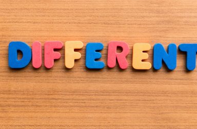
The choice of colors
It will allow quick and optimal memorization of your company’s image. As you probably know, each culture has its own interpretation of colors. White, a symbol of purity in Europe, is assimilated to mourning in Asia. It will therefore be necessary to take into account your target audiences to determine the colors that will represent your business.
The meaning of colors in Europe:
- red : energy, power, passion, love, blood, speed, anger
- the orange : joy, enthusiasm, attraction, success, fire, sun, light, warmth
- brown: earth, strength, naturalness, rustic, solidity, stability, warmth, comfort
- yellow: stimulation, attention, domination, light, cheerfulness, youth. Yellow is sometimes also associated with low-cost (Lidl, Ryanair, etc.)
- pink : seduction, romanticism, tenderness, happiness, femininity
- green : relaxation, prestige, nature, calm, serenity
- blue: it is the favorite color of Europeans. Blue symbolizes confidence, calm, wisdom, serenity, security
- purple: spirituality, ceremony, royalty, knowledge
- black: mystery, submission, danger, sex
- white: purity, innocence, cleanliness, neutrality, impartiality
It is therefore essential to think about the choice of colors depending on the meaning and values you want to convey. As for the choice of typographies, it is better to limit the color range to four or five colors to ensure proper assimilation by your audience.
- The graphic charter freezes the choice of colors with their Pantone, CMYK, RGB and hexadecimal values. If these colors are used to display your logo, the graphic charter must specify the conditions of their use.
- Sometimes companies have graphic elements and icons in addition to their logo. The latter aim to strengthen the brand identity for each product or service is there. We can take the example of Orange which declines its subscription formulas using animal pictograms. Be careful not to overdo it and dilute your identity.
For the use of images, photos or illustrations, you will also need the graphic charter. It will define the criteria that these visual elements must meet in order to be used by the company.
We can take as an example the advertisements of the Benetton brand in the 90s where the name of it should not even appear in large on the image so that we recognize it immediately.
Editorial rules
The graphic charter also defines the tone and writing style that you use in your productions. Editorial rules help the writer to produce consistent documents.